I redesigned key interactions across a developer platform to make deploying data apps feel less like infrastructure
By auditing the full Dash Apps experience and designing across the deploy, upload, and dashboard flows, I introduced motion and UI refinements that make a complex product feel responsive and human, with three features shipped to production during the practicum.
My role
Timeline
2 months
Collaborators
Nathan (PM), Jerome Valdez (Mentor)

Plotly Cloud's Dash Apps had no motion design language and several emotionally flat moments across its core flows.
Card states were static, the upload zone was inert, and empty states were blank. For a product asking developers to trust it with their work, the experience offered no feedback, no warmth, and no sense of progress.
Targeted motion and UI interventions across the highest-impact moments in the deploy, upload, and dashboard flows.
Audited 13+ screens across the deploy, upload, and dashboard flows and designed targeted interventions for the highest-impact moments. Card state animations gave the build process a visual heartbeat. The upload zone was redesigned with a characterful hover state, lavender background wash, and a hidden Easter egg. The dashboard was redesigned to respond to where users are in their journey, with action cards and a recently viewed carousel. Three features shipped to production during the practicum.
Pre-Design Intervention
Post-Design Intervention
A theme-based audit of 13+ screens across the full Dash Apps experience, from first login to deploy.
Findings were then organized into five problem themes in priority order, surfacing where the product felt flat, inconsistent, or unclear, and giving the design work a focused starting point.

From a static row in a table to a living deploy experience.
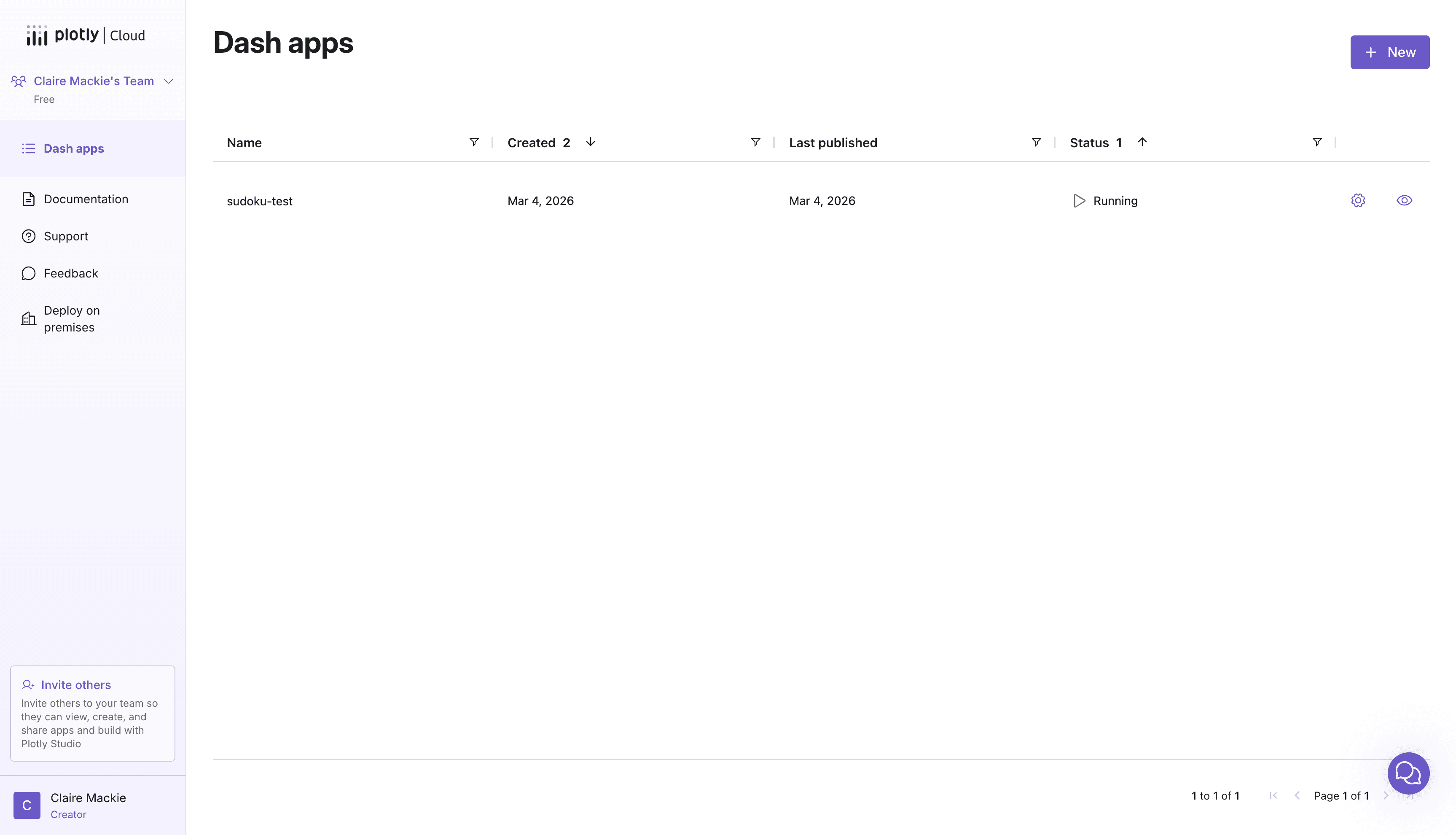
The card states were the first and highest-impact area to tackle. The existing dashboard gave users no visual feedback during the deploy process — a card looked the same whether an app was building, running, or had failed. The redesign introduced four distinct states (empty, building, running, error) each with motion and color that communicates status at a glance, without requiring the user to read anything.
Publish to Dash Apps Static Transition
Card state interactions
Improved Card State Prototype
Link to Iterations
Technical Constraints
The building and starting states each take 15+ seconds, making a loading indicator essential.
Early explorations included a determinate progress bar for these states, but the engineering team couldn't provide reliable time estimates. The design pivoted to an indeterminate animation that still communicates activity and reassures users that the process is working, without requiring backend data that didn't exist.
Upload Hover Page
From an inert drop zone to a hover state with character, a lavender wash, and a hidden Easter egg.
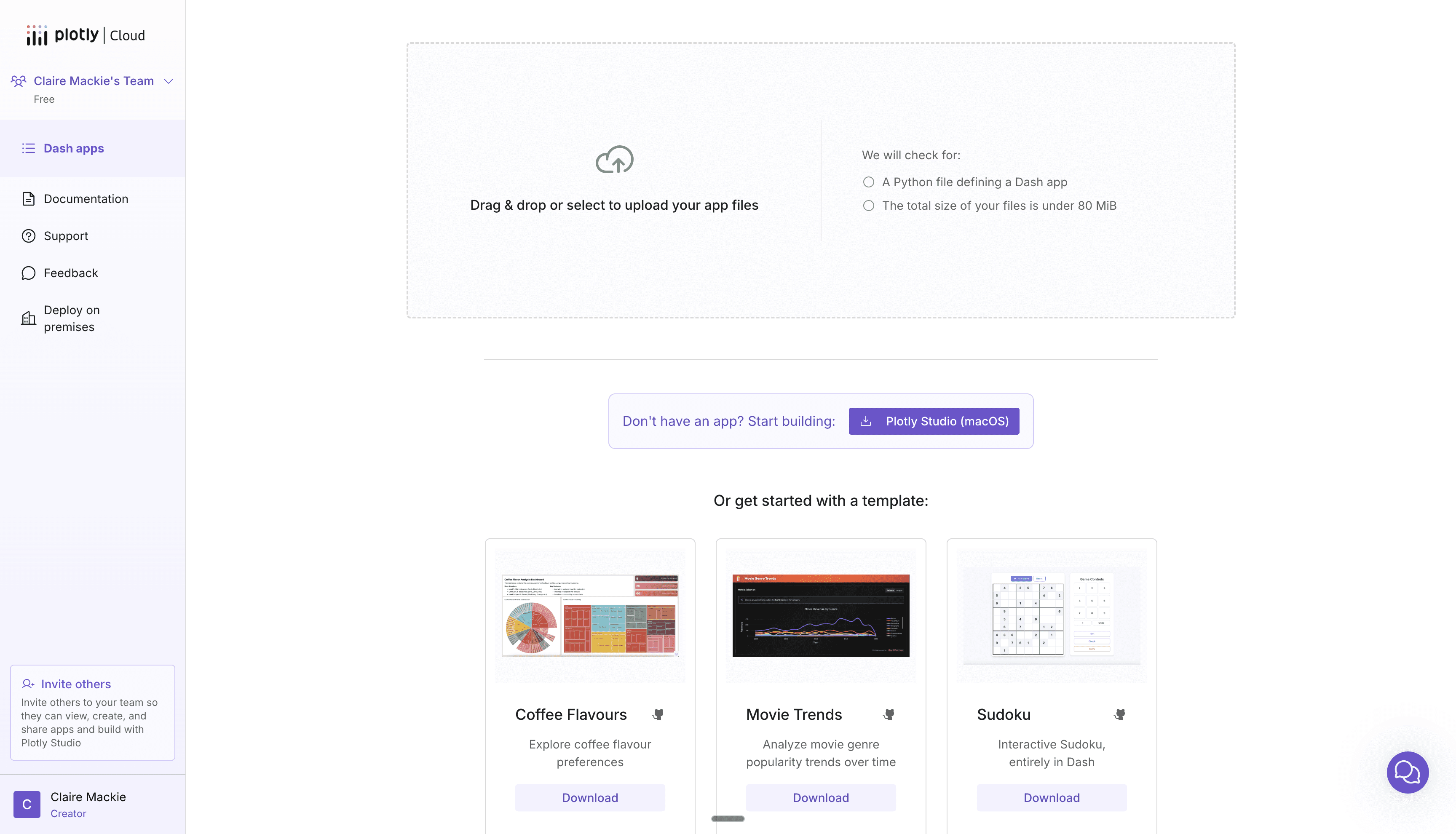
The existing upload area was static. No hover feedback, no personality, no warmth. I built an HTML prototype environment with 12+ variations ranging from subtle to expressive, testing what Plotly's motion language could feel like. The final direction paired a cloud puff animation with a lavender background wash, with a one-in-ten chance of an alien Easter egg for curious users.
Pre-Design Intervention
Post-Design Intervention (with placeholder sidebar + template UI for context)
Link to Iterations
The existing error state only let users remove files and start over, punishing mistakes instead of helping users recover.
The redesign introduced an "Add more files" button that opens the file picker without clearing the existing selection. Users can fix problems in place instead of losing their progress and starting from scratch.
Pre-Design Intervention
Post-Design Intervention
Designing two distinct experiences for users who haven't deployed yet and users coming back to check on their apps.
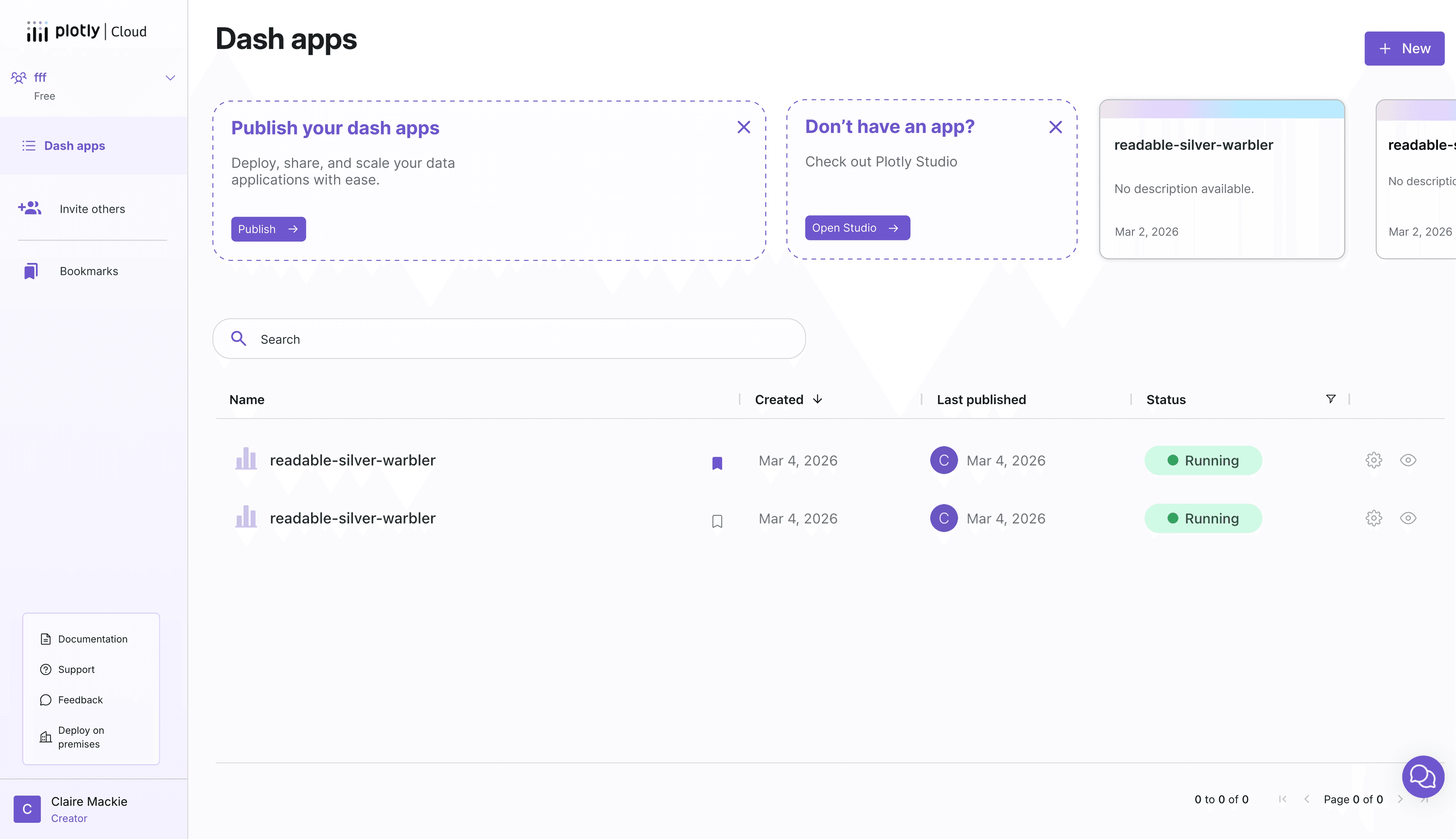
The existing dashboard treated every user the same, whether it was their first visit or their fiftieth. New users saw an empty table with no guidance. Returning users had to scan a flat list with no sense of recency. The redesign introduced a warm empty state with clear next actions for newcomers, persistent action cards for publishing or getting started with Plotly Studio, and a recently viewed carousel so returning users can pick up where they left off.
Pre-Design Intervention
Post-Design Intervention
Designing a way for users to manage a growing list of apps without adding technical complexity.
The initial proposal was a folder system, but the sharing permissions it required made it too technically complex to implement. The design pivoted to a lighter approach: bookmarks for quick access to frequently used apps, a search bar, and a card view/list view toggle. A tag system was also explored but ultimately set aside. The final direction gives users the organizational tools they need without introducing backend complexity that would delay shipping.
Bookmarks + card view demo
Search Bar And Discarded Tags System
Three features shipped to production during a two-month practicum.
Card state animations brought the deploy flow to life and are in production. The getting started banner guides new users toward their first publish or into Plotly Studio, with smart dismissal logic based on whether they already have apps. A redirect page redesign streamlined the post-install experience and is expected to drive a measurable traffic increase to Plotly Cloud. Beyond what shipped, the upload interaction and dashboard redesigns established a direction for how Plotly Cloud should feel going forward.