Ohme
Our focus was to create a more user-friendly online experience that stayed true to OHME’s aesthetic.
My role
Timeline
3 days
Collaborators
Kataryna, Kayla, Simon


OHME was seeking a website redesign that aligned with their existing aesthetic while improving clarity and engagement.
Additionally, OHME aimed to simplify the shopping experience by reducing the number of clicks required to complete a purchase, making the process more seamless and user-friendly.
Keeping OHME!, OHME, — but more concise, more engaging, and more sales.

In exploring branding directions, my goal was to reflect OHME’s mission: making healthy snacking effortless and enjoyable.
I aimed to highlight OHME’s vibrant product packaging, and to capture both the playful energy of the brand and their dedication to wellness.

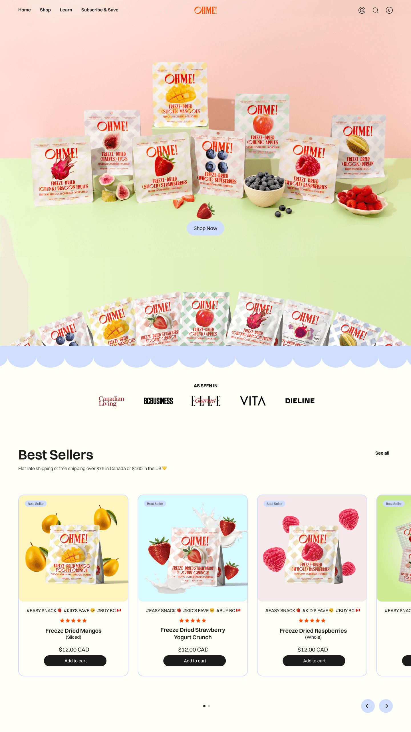
Through my audit of OHME’s existing site, I concluded that a simplified mega menu would better serve users by allowing them to reach their desired pages quickly.

Close inspection of Ohme's original website revealed some accessibility issues and UX/UI optimization opportunities.
Some of the issues I found included a lack of contrast, confusing overall layout, phrasing issues, and overwhelming/cluttered sections.


Overall, the UI was refined for better accessibility, readability, and engagement.
I addressed the issues through the UI, and added some fun & visual flare.

I reimagined the product page to follow familiar UI patterns for ease of use, and strengthened the overall visual hierarchy was to guide users through the page.
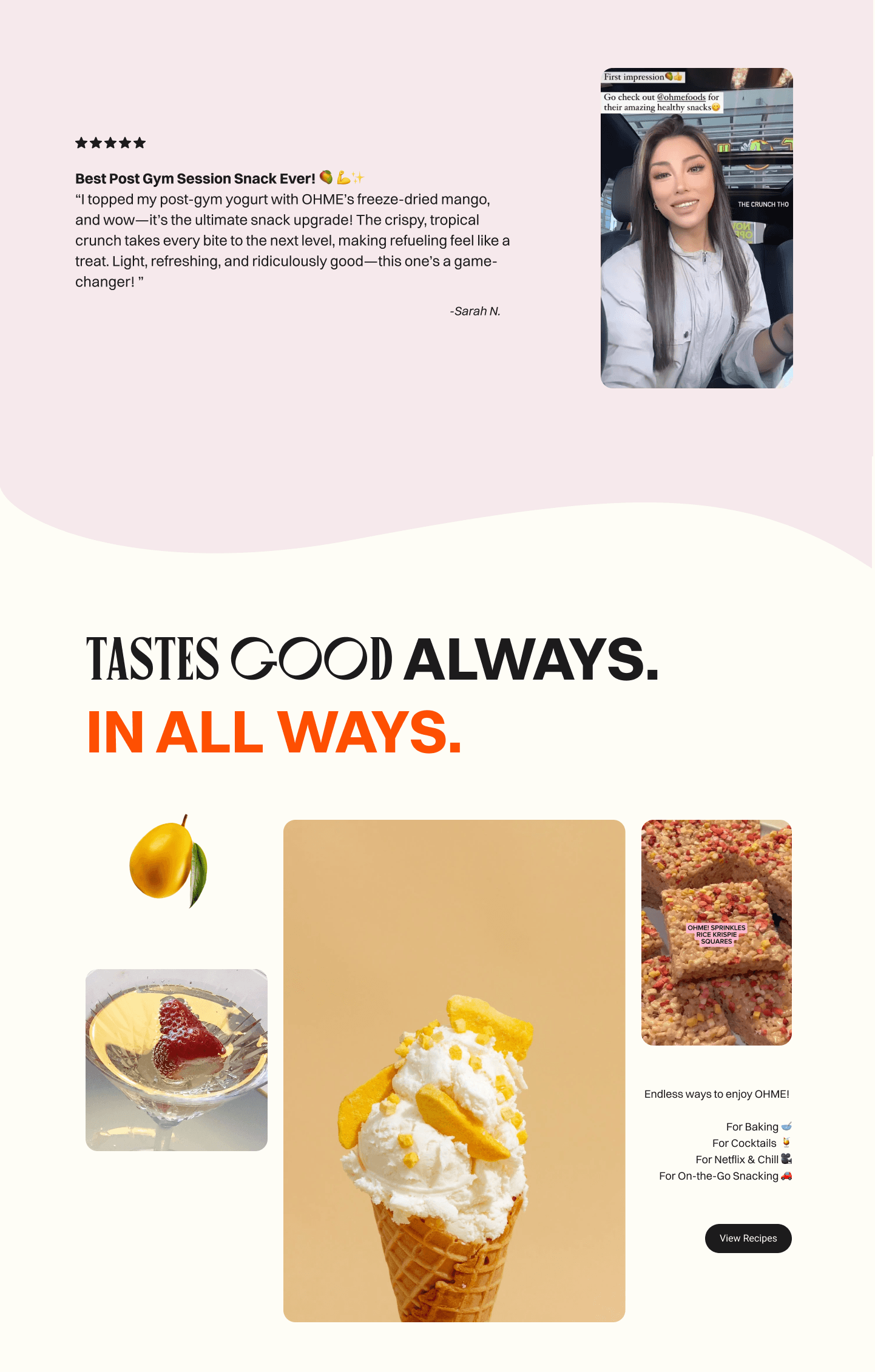
We added features like a product image carousel and a slider-based 'More Picks' section. Reviews became clearer and more engaging.

Redesigning Ohme’s website in just three days was both challenging and rewarding. Although our team didn’t win the hackathon, the project had an unexpected success: Ohme reached out afterward, impressed by our work, and invited us to collaborate further.
Demonstrating that a thoughtful, user-focused redesign—even within a tight three-day timeframe—can showcase brand potential.